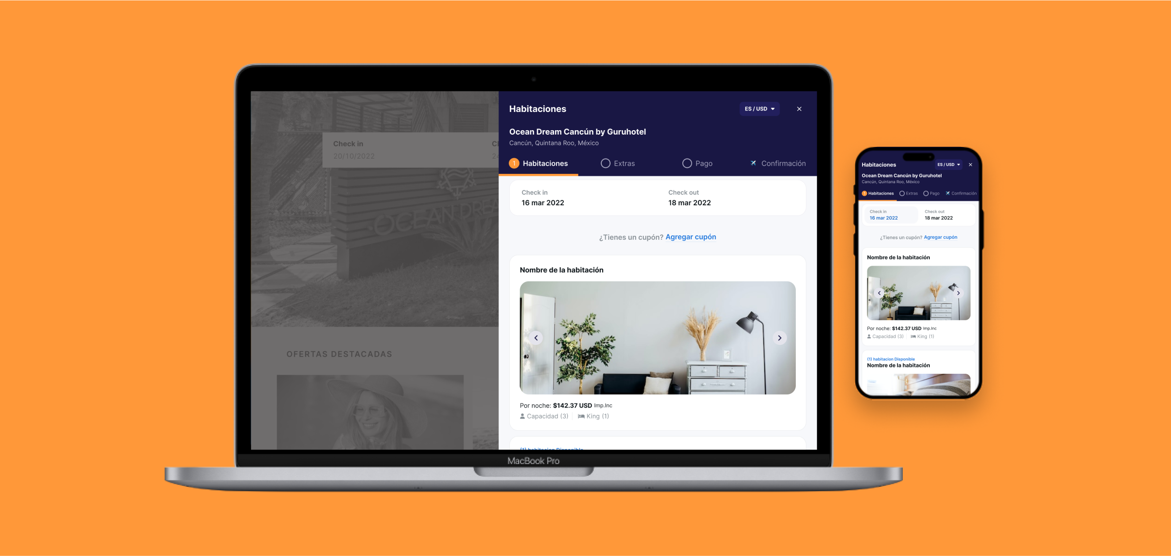
Timeline:
July 2021 – June 2023
UX Research, UX/UI Design
THE PROBLEM
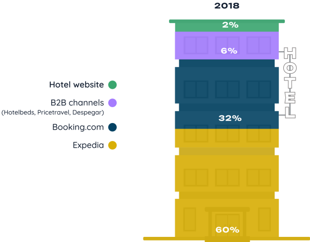
Online travel agencies(OTAs) Booking and Expedia dominate hotel reservation sales, generating over 90% of online bookings.
THE OPPORTUNITY
Nobody is paying attention to the most profitable online sales channel for the hotel.
- Online travel agencies like Booking and Expedia generate 90% of hotel reservations with commissions of almost 30%. Meaning the hotel only keeps 60% of the sale (still needs to deduct hotel operational costs).
- Direct sales trough hotels website represent 100% profit for the hotel.

THE PROCESS
“A website that is not browsable is unreliable”
- One of the travelers in the usability test.
After a UX Audit and several interviews with internal users and external B2B clients, it got cleared to me that we needed to improve first our external tool: Check out.
Heuristic analysis
In order to start organizing features to solved, I decided to make an Heuristic analysis. Which also allowed me to be more disciplined and to respect screen by screen order within each purchase step so I didn’t skip any obvious issue.
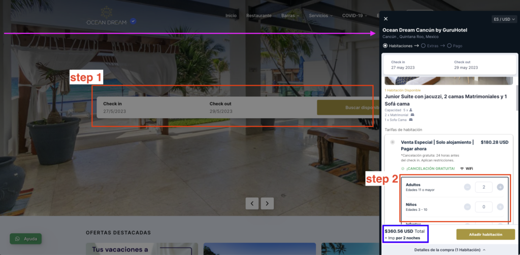
- In pink you can see all the white space being wasted. The number one goal of an hotels website is to increase direct reservations, and this starts when the user opens the Check out. Which in this case is a very small scramble screen on a third of the main screen.
- In red, my nightmare: separated in two steps within different screens, the most important information to ask the user in order to offer them the product that best suits their needs and pretty much closes the deal: travel dates and number of people.
- In blue the total costs, before taxes. The user has to read that info and not get mistaken on thinking that what they see is the final price. (In some countries this is illegal)
THE SOLUTION
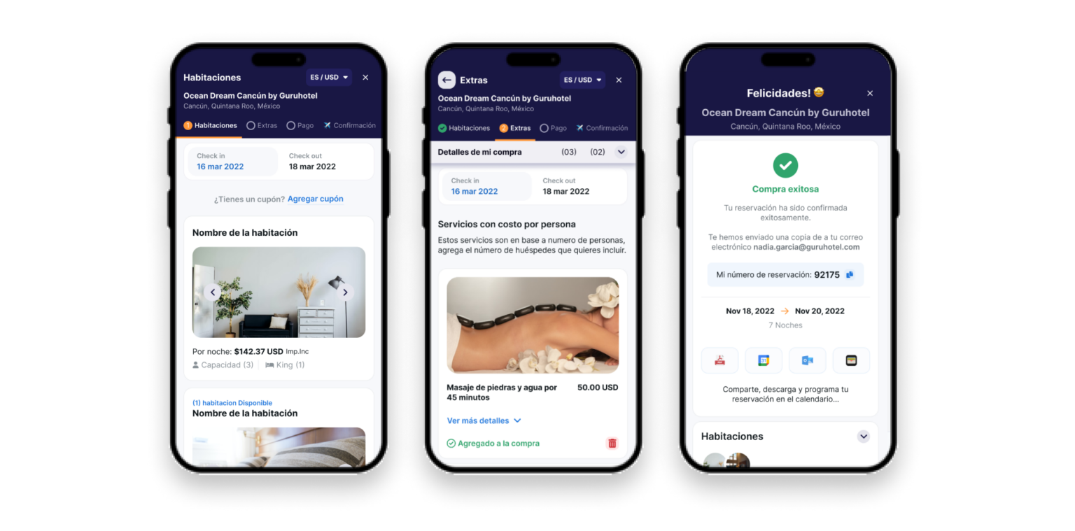
Introducing the new image of Check out. A more simple to use and beautiful platform that feels more secure.
- Mobile first as 85% of online bookings are made trough mobile devices.
- With a much clearer purchase process the user won’t feel insecure at the moment to pay.
- Extra services with perfect timing in order to offer an added value to both guests and B2B clients as OTA’s won’t allow to add them in their dashboards.
RESULTS AND IMPACT
By the end of 2022, thanks to our proposal, direct sales of the hotels we work with reached 20%
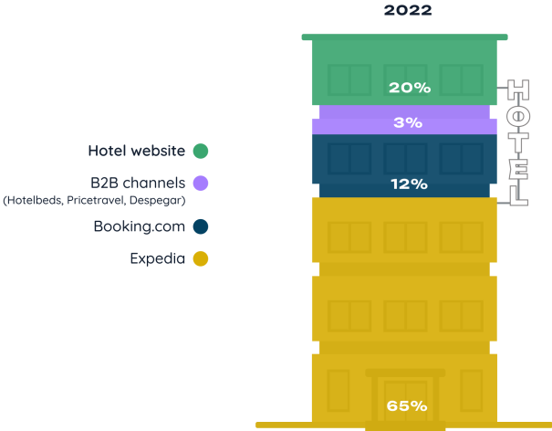
It was a combination of our sales department force and a well designed product. By negotiating the best rates and achieving an awesome user experience on our Check out.
